These articles serve as a comprehensive guide and quick reference for navigating HubSpot. If you're looking for articles tailored to your specific role, check out the Categories available on the Knowledge Base home page.
Table of Contents:
Create a Report
To begin creating a report, it is best to utilize existing templates for a smoother process. This article will guide you through using templates to simplify both the creation and retrieval of your report later on.
To start creating your report:
- In your HubSpot account, navigate to Reporting > Reports.
- In the upper right, click Create Report.

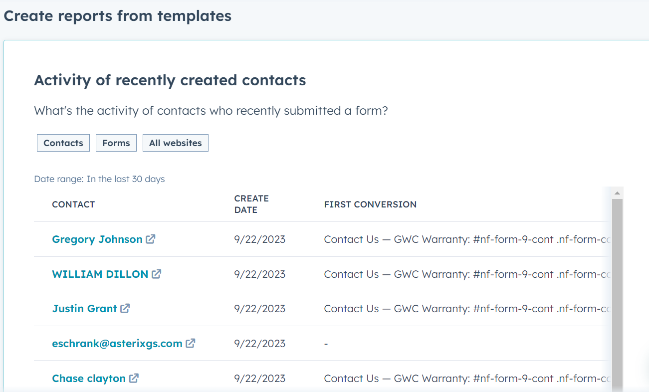
- Ignore the "Create reports from scratch" section at the top and scroll down to the "Create reports from templates" section to see if there's a Report close to what you want to start from.

- Hover over the template that best matches your needs and click on it to access an editable preview of the report.
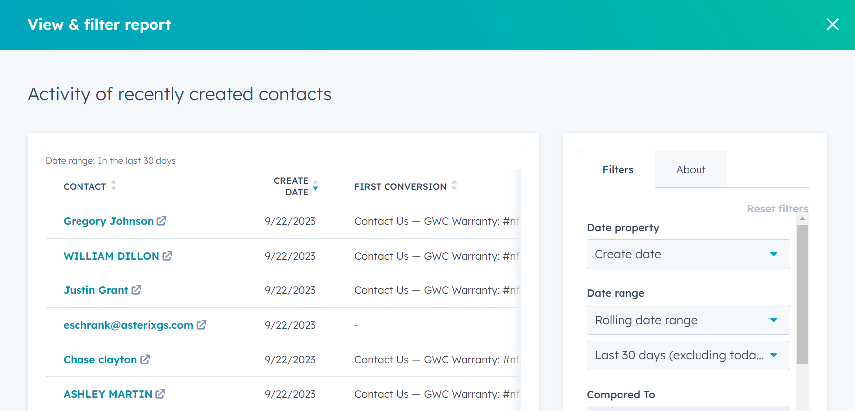
- The preview's right panel displays the "Filters" section with existing options and the ability to add more filters by clicking on "+ Add filter" at the bottom. This opens a search bar for fields related to the Object(s) in the Report. Further details about these filters will be discussed shortly.
- Consider including notes about the content of your report for future reference in the "About" tab located to the right of the "Filters" tab.
- Lastly, at the bottom, you have the option to save your new report or customize it. Customization allows you to add or rearrange fields in the report, include summaries or visualizations of the data for a quick overview, and make basic edits such as naming the report, sorting it, or exporting it to Excel.
Pro tip: Consider using CSV format unless you want to incorporate intricate formatting.
Customizing a Report with Filters
As seen earlier, you can customize or add filters from the Preview of the Report Template or you can edit them within the Customization view by clicking the "Filters" button on the top left of the window.

- If you filter by Date field, you're prompted to either choose from a preset list of relative dates, e.g. "This calendar year" or "Last 7 days", or enter a specific date range, e.g. using "is after" and "is before" to lock in just those results. As with any field, "is known" and "is unknown" is a True/ False filter that checks if the field is blank.
- If you filter by Number field, your filter options are the same but you do not have the relative dates preset.
- If you choose Picklist field, i.e. the values entered are restricted to a set, e.g. "Decision Maker" or "Influencer" for the Contact's Role, your filter options will reflect only those values as "is any of" or "is none of".
- If you choose Text field, i.e. a non-restricted field but which may contain numbers or characters, your filter options change to "contains exactly" or "doesn't contain exactly" which will search for exactly the value you enter for that field.
- If you choose Owner (or Team) field, a reference to another user or Team in HubSpot, you'll get a searchable list of Users with a checkbox beside each.
Add, Remove, or Rearrange Properties (Fields)
By clicking the "Data" tab over the top of the Report preview, the left panel switches to show which Properties (or Fields) you've selected, what order they are in, and a button to "Add __ Property", which opens both a full list of Properties for the Object(s) in your Report and a search bar to jump right to the valuable data metric your Report needs.
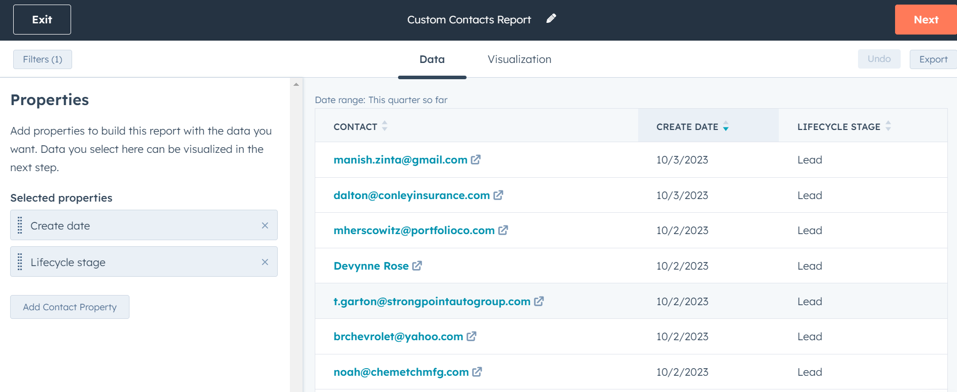
Drag-and-drop the Properties into whichever order you want them to appear, this will be reflected in the main preview section of your window.
To customize how you want the results to be organized, simply click on the column name within the preview section. This customization will be saved, allowing you to easily rearrange the results when viewing them later on.
Group and Summarize Data, Add Charts, and Share your Report
By clicking the "Visualization" tab over the top of the Report preview, the left panel switches to show how your Report is configured.
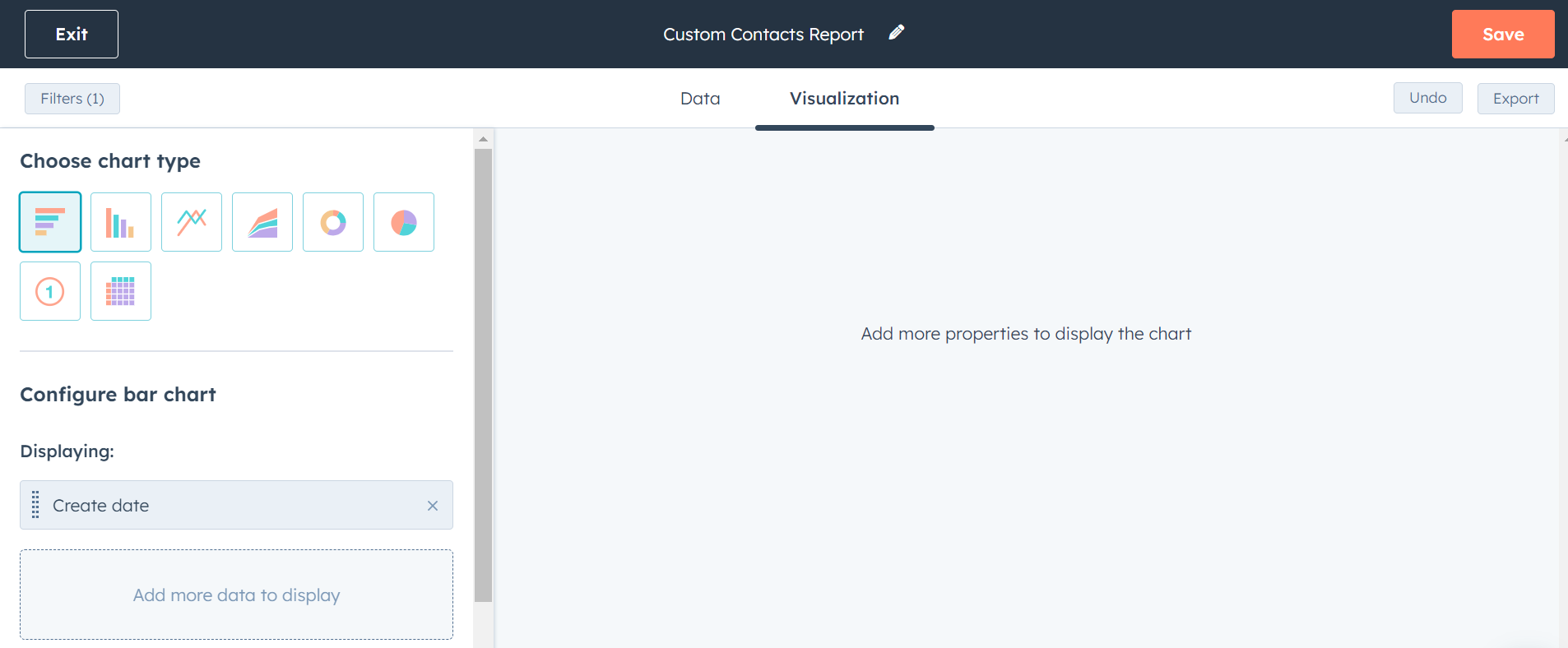
The commonly used report is the "Table" chart, with columns and rows of records which you can summarize by particular properties to get record counts for each value entered in it, e.g. "Create Date" and "Count of Contacts" initially shows the number of Contact records created on each Date that match your filter criteria. You can then Group that data by clicking the "Frequency" drop-down on the top-right side of the Preview and changing it to "Monthly" or "Yearly", etc.
You can experiment with the best way to showcase the data you're looking for by clicking through the different chart types at the top of the left panel. All of them will collapse the record rows but they can still be accessed by clicking the hyperlinked total under the Count column for more, targeted, detail.
Some Chart Types will allow you to Compare the results in your Report to a different, preset range alongside it, by clicking the "Display options" drop-down menu at the top-right of your window with "Compared to previous 30 days" or "Compared to year before" options.
Lastly, Save your Report with the option to add it to a new or existing Dashboard (which will be covered in the next article). You can also Schedule Reports to be delivered to your email or share them with specific team members or stakeholders by clicking the "Share" button.